Chapter 5. Input fields and buttons
Index
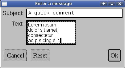
The following program creates a small window with some input fields and buttons.
/*
** Copyright 2017-2021 Double Precision, Inc.
** See COPYING for distribution information.
*/

#include "config.h"
#include "close_flag.H"

#include <x/exception.H>
#include <x/destroy_callback.H>
#include <x/appid.H>
#include <x/w/main_window.H>
#include <x/w/gridlayoutmanager.H>
#include <x/w/gridfactory.H>
#include <x/w/label.H>
#include <x/w/text_param_literals.H>
#include <x/w/font_literals.H>
#include <x/w/input_field.H>
#include <x/w/container.H>
#include <x/w/canvas.H>
#include <x/w/button.H>
#include <x/w/shortcut.H>

#include <string>
#include <iostream>

std::string x::appid() noexcept
{
	return "inputfieldsandbuttons.examples.w.libcxx.com";
}

// inputfields.inc.H is autogenerated from inputfields.xml

#include <x/refptr_traits.H>
#include "inputfields.inc.H"

// inputfields gets installed in main_window->appdata, below.

class appdataObj : virtual public x::obj,
		   public inputfields {
public:

	using inputfields::inputfields;
};

typedef x::ref<appdataObj> appdata_t;

// This is the creator lambda, that gets passed to create_mainwindow() below,
// factored out for readability.

void create_mainwindow(const x::w::main_window &main_window,
		       const close_flag_ref &close_flag)
{
	// Each display element contains an optional 'appdata', a
	// generic LibCXX object, an x::ptr<x::obj>, that the library ignores,
	// and is for application to use.
	//
	// This can be a convenient place to store all display elements that
	// get created in the main application window.
	//
	// As discussed in the library's documentation, parent display
	// elements own references to their child display element, and
	// this main_window is the topmost display elements, so it's a
	// logical place to store all display elements for the application
	// to quickly reference.
	//
	// Using some innermost display element to store references to parent
	// display elements creates a circular reference, which will interfere
	// with LibCXX's object model anyway.
	//
	// We're going to use some framework templates and classes from the
	// LibCXX base class library.
	//
	// inputfields.inc.H gets generated from inputfields.xml by the
	// Makefile, and included above, and declares an inputfieldsptr class
	// containing ptrs to our input_fields, which we can install at our
	// leisure.

	inputfieldsptr new_inputfields;

	auto layout=main_window->gridlayout();

	// The main window's grid will have two columns. The first column
	// in each row will have a label, the second column will have a
	// text input field.

	// The labels will be aligned against the right margin of the
	// first column, to make them flush to the input field.

	// First row in the main window contains a label and an input field.

	x::w::gridfactory factory=layout->append_row();

	// Besides the right alignment, set the vertical alignment of the
	// label to middle, it looks better.

	factory->halign(x::w::halign::right)
		.valign(x::w::valign::middle)
		.create_label({"Subject:"});

	// And just in case we have some weird theme where the input field
	// is shorter in height than the label, align it vertically also.

	// The input fields initial contents are empty, and it is size to
	// be 30 columns.
	auto subject_field=factory->valign(x::w::valign::middle)
		.create_input_field("", {30});

	// Give the subject field a tooltip.

	subject_field->create_tooltip("A brief title");

	// Save it in new_inputfields

	new_inputfields.subject=subject_field;

	// Second row in the main window

	factory=layout->append_row();

	// It doesn't look like we need to vertically align either the label
	// or the column.
	factory->halign(x::w::halign::right).create_label({"Text:"});

	// That's because the second row's input field will have 30 columns
	// and four rows.
	//
	// Also, let's make the input field use a non-default, proportional
	// font, and set its initial contents to "Hello".
	//
	// The first parameter to create_input_field() is an x::w::text_param
	// that can specify the input field's font.

	auto text_field=factory->create_input_field({"arial"_font,
				"Hello,\n\n"},
		{30, 4});

	// The tooltip for the text field. Slightly longer tooltip, word
	// wrap it to 30 mm width.

	x::w::label_config tooltip_label_config;

	tooltip_label_config.widthmm=30;

	text_field->create_tooltip("A brief message, a few lines long.",
				   tooltip_label_config);

	// Save it in new_inputfields

	new_inputfields.text=text_field;

	// The third row of the main window will have all the buttons.
	//
	// First, create a nested container, which will span both columns,
	// and also use the grid layout manager.

	factory=layout->append_row();

	// Give the container some extra padding on the top.
	factory->top_padding(3.0)
		// Span it across both columns
		.colspan(2)
		.create_container
		([&]
		 (const auto &container)
		 {
			 // Get the grid layout manager for the container.

			 auto layout=container->gridlayout();
			 auto factory=layout->append_row();

			 // Cancel button, on the beginning of the row.

			 auto cancel=factory->create_button
				 ({"Cancel"},

				  // Button options:
				  //
				  // Esc key for a shortcut
				  x::w::shortcut{'\e'});

			 // Next to it is a "Reset" button, with an
			 // underlined "R", with an "Alt"-R shortcut.
			 // "R" can be specified in upper or lowercase.

			 auto reset=factory->create_button
				 ({"underline"_decoration,
				   "R",
				   "no"_decoration,
				   "eset"},

					 // Button options, keyboard shortcut.

					 x::w::shortcut{"Alt",'R'});

			 // Add empty space here, between the buttons.
			 // By default, create_canvas() creates a canvas
			 // that specifies 0 for its minimum and preferred
			 // size, with the maximum size unspecified (effectively
			 // infinite.
			 //
			 // This allows the grid layout manager to
			 // size the canvas spacer to fill the entire width
			 // of the edit button row.
			 //
			 // There's also a create_canvas() that takes a
			 // creator lambda, and explicit metrics specifications
			 // as parameters, for implementing more nuanced
			 // spacing.

			 factory->create_canvas();

			 // The "Ok" button at the end of the row.

			 // An alternative overload of create_button()
			 // takes a generic callable object as the first
			 // parameter instead of a label.

			 auto ok=factory->create_button
				 ([]
				  (const x::w::factory &f)
				  {
					  // The callable object uses the
					  // factory parameter that it
					  // receives as its own parameter
					  // (and not the factory that's
					  // creating the button itself).
					  //
					  // The callable object uses this
					  // factory to create the display
					  // element that becomes the button's
					  // contents. This can be a container
					  // with many display elements.
					  //
					  // Using create_label() is equivalent
					  // to using create_button() directly
					  // with a text string:

					  auto l=f->create_label("Ok");

					  // As with any other display element,
					  // it must be show()n to be visible.
					  l->show();
				  },
				  // Two options for this button. The second
				  // parameter to create_button() is an
				  // variadic template for all needed options,
				  // that must be passed in as a single
				  // parameter, in the listed order, see the
				  // documentation.
				  //
				  // Uniform initialization syntax is the
				  // easiest way to go:
				  {
					  // Thicker border, visual indication
					  // of a default button.
					  x::w::default_button(),
					  // Enter key for a shortcut
					  x::w::shortcut{'\n'}
				  });

			 // Specify what happens when the buttons get
			 // activated.

			 cancel->on_activate([close_flag]
					     (ONLY IN_THREAD,
					      const x::w::callback_trigger_t &trigger,
					      const x::w::busy &ignore)
					     {
						     std::cout << "Cancel"
							       << std::endl;

						     close_flag->close();
					     });

			 // Note that the Reset button's callback captures
			 // the input field object by value. This is ok,
			 // the input fields are not parent display elements
			 // of the Reset button. When the main window gets
			 // destroyed, the main window object drops its
			 // references to its display elements, including
			 // the Reset button, which then drops its reference
			 // on the input field elements, which allows them
			 // to be destroyed.

			 reset->on_activate([text_field, subject_field]
					    (ONLY IN_THREAD,
					     const x::w::callback_trigger_t &trigger,
					     const x::w::busy &ignore)
					    {
						    text_field->set("");
						    subject_field->set("");
					    });

			 ok->on_activate([close_flag]
					 (ONLY IN_THREAD,
					  const x::w::callback_trigger_t &trigger,
					  const x::w::busy &ignore)
					 {
						 std::cout << "Ok"
							   << std::endl;

						 close_flag->close();
					 });
		 },
		 x::w::new_gridlayoutmanager());

	// Now that our fields have been saved in new_inputfields, we can
	// construct an ref<obj> out of them, and attach them to main_window's
	// appdata.
	//
	// This create_mainwindow() is, after all, main_window's creator, so
	// this is a part of our mission statement.

	main_window->appdata=appdata_t::create(new_inputfields);
}

void inputfieldsandbuttons()
{
	x::destroy_callback::base::guard guard;

	auto close_flag=close_flag_ref::create();

	auto main_window=
		x::w::main_window::create([&]
					  (const auto &main_window)
					  {
						  create_mainwindow(main_window,
								    close_flag);
					  });

	main_window->on_disconnect([]
				   {
					   _exit(1);
				   });

	guard(main_window->connection_mcguffin());

	main_window->set_window_title("Enter a message");
	main_window->on_delete
		([close_flag]
		 (ONLY IN_THREAD,
		  const x::w::busy &ignore)
		 {
			 close_flag->close();
		 });

	main_window->show_all();

	close_flag->wait();

	// Retrieve the appdata_t, with our fields, that the creator attached
	// to the main_window.

	appdata_t appdata=main_window->appdata;

	// Retrieve each input_field, and get() its contents.

	// Each input_field must be locked, first:

	x::w::input_lock subject_lock{appdata->subject};
	x::w::input_lock text_lock{appdata->text};

	std::cout << "Subject ("
		  << subject_lock.size()
		  << " character): " << subject_lock.get() << std::endl
		  << std::endl << text_lock.get();

	// Normally it's possible that a character gets typed after
	// size() returns, and before get() gets called, hence the
	// get() would return a shorter or a smaller string (let's ignore
	// for the moment that size() returns unicode character count,
	// and get() returns UTF-8).
	//
	// However, the input_lock blocks the internal library execution
	// thread from accessing the contents of the field, so that can't
	// happen.
}

int main(int argc, char **argv)
{
	try {
		inputfieldsandbuttons();
	} catch (const x::exception &e)
	{
		e->caught();
		exit(1);
	}
	return 0;
}
Input fields
A factory's
create_input_field() method returns a new
x::w::input_field.
create_input_field()'s parameters are:
A
x::w::text_paramthat sets the initial contents of the text input field.An optional
x::w::input_field_configparameter sets the number of rows and columns in the new input field.
inputfieldsandbuttons.C
creates two text input
fields. The first input field is 30 columns wide, and is a single line
text input field, by default.
The x::w::text_param parameter
cannot contain any
formatting or color options, except that the
x::w::text_param
can optionally specify an initial font or color.
inputfieldsandbuttons.C's second text input
specifies a non-default proportional font. The second text input
field has four rows, and also 30 columns. However, the second text
input field's width is smaller because of the
non-default proportional font.
A single line text input field, by definition, accepts a single line of text. The Enter key does nothing. A single line text input field scrolls horizontally if more text is entered than can fit within its margins. A text input field consisting of two or more lines word-wraps instead of scrolling horizontally, and inserts a hard line break in response to the Enter; and scroll vertically when the text has more rows than can fit into the text input field.
Clipboards
LibCXX Widget Toolkit's text input fields use the primary and the secondary clipboard.
- Primary clipboard
Holding a Shift while moving the cursor, or dragging over the text while holding the first mouse pointer button down, creates a primary text selection. Releasing the Shift key or the mouse pointer button copies the highlighted text to the primary clipboard. The primary clipboard is temporary, and the copied text gets removed from the clipboard after the next keypress.
Ctrl-Space inserts the text from the primary keyboard at the current cursor position, if another window copied some text to the primary clipboard (or from another text input field in the same window).
- Secondary clipboard (copy/cut/paste)
The copy, cut, and paste operations use the system's secondary clipboard by default. The cxxwtheme command provides an option to use the primary clipboard for the copy, cut, and paste operation.
After making a primary clipboard selection, Ctrl-Insert copies the primary clipboard selection to the secondary clipboard (the “Copy” operation). Shift-Delete copies it and deletes the selected text, the “Cut” operation (Delete by itself deletes the selected text without copying it).
A secondary clipboard selection remains in place until it's replaced by another secondary clipboard selection; unlike the primary clipboard selection it does not get automatically removed. Shift-Insert inserts the text from the secondary clipboard at the current cursor position (the “Paste” operation).
Enabling the option to use the primary clipboard for copy/cut/paste operations in cxxwtheme has the effect of not use a secondary clipboard, but have these keyboard commands copy or cut the selected text semi-permanently to the primary clipboard. Highlighting the text immediately puts it into the primary clipboard. The selected text remains in the primary clipboard if it gets copied or cut, and the primary keyboard selection remains in place once the selected text is no longer highlighted. The paste key combination, Shift-Insert, and the primary clipboard paste key, Ctrl-Space, have the same results.
Additionally all text input fields accept plain text that gets dragged and dropped from other windows. After making a primary selection: pressing the first pointer button with the pointer on top of the primary selection drags the selected text for dropping into other windows that accept dropped text. The pointer changes shape to indicate whether the other application accepts plain text dropped content (this includes other enabled text input fields in the same window).
Pointer button #3 (typically the right mouse button) opens a context menu popup with “Copy”, “Cut”, and “Paste” options. Each option is enabled only when the corresponding operation is possible (some text is selected, or pasted text is available). It's also possible to create a custom context popup menu, with or without these default options. See Chapter 26, Copy/Cut/Paste menu items for more information.
Using x::w::input_field
f->set("Hello world");

f->on_change([]
             (ONLY IN_THREAD,
              const x::w::input_change_info_t &info)
             {
             });

f->on_autocomplete([]
                  (ONLY IN_THREAD,
                   x::w::input_autocomplete_info_t &info)
                  {
                        return false;
                  });
set() is overloaded for a
std::string, and a
std::u32string.
on_change() and
on_autocomplete() install
callbacks.
These callbacks are mostly for use by
combo-boxes, but are
publicly documented.
on_change() installs a callback that gets
invoked anytime the contents of the input field get changed.
This callback receives a connection thread handle and an
x;:w::input_change_info_t
parameter that provides some context for the change.
When the change to the input field results in more text getting
added to
the end of the field, the
on_autocomplete() callback also gets invoked.
This callback also receives a connection thread handle, but with a
x;:w::input_autocomplete_info_t
object.
The on_autocomplete() callback returns
false if the contents of the input field cannot
be auto-completed; otherwise the callback places the requisite
details into the
x;:w::input_autocomplete_info_t parameter
and returns true.
x::w::input_lock lock{f};
Constructing a
x::w::input_lock
has the unsurprising result of blocking other execution threads from
accessing the x::w::input_field given
by the parameter to
x::w::input_lock's constructor.
At that point,
x::w::input_lock's methods provide access
to the input field's current contents, and other metadata.
Note
x::w::input_field's
set() method replaces the contents of
the
x::w::input_field. Like all other
widgets, the
x::w::input_field actually gets updated
by LibCXXW's internal execution thread.
A non-IN_THREAD
set() does not get blocked directly by an
x::w::input_lock.
All that set() does is send a message
to the execution thread with the new contents of the input field.
As with other locks,
x::w::input_locks should not persist
for a long time, and should get destroyed quickly;
otherwise it'll likely end up blocking
LibCXXW's internal execution thread, with the display appearing
to freeze.
This also means that acquiring an
x::w::input_lock immediately after a
non-IN_THREAD
set() can still return the
input field's former contents from
x::w::input_lock's
get(), if the
x::w::input_lock gets acquired before
the internal execution thread gets the opportunity to update the
input field's contents.